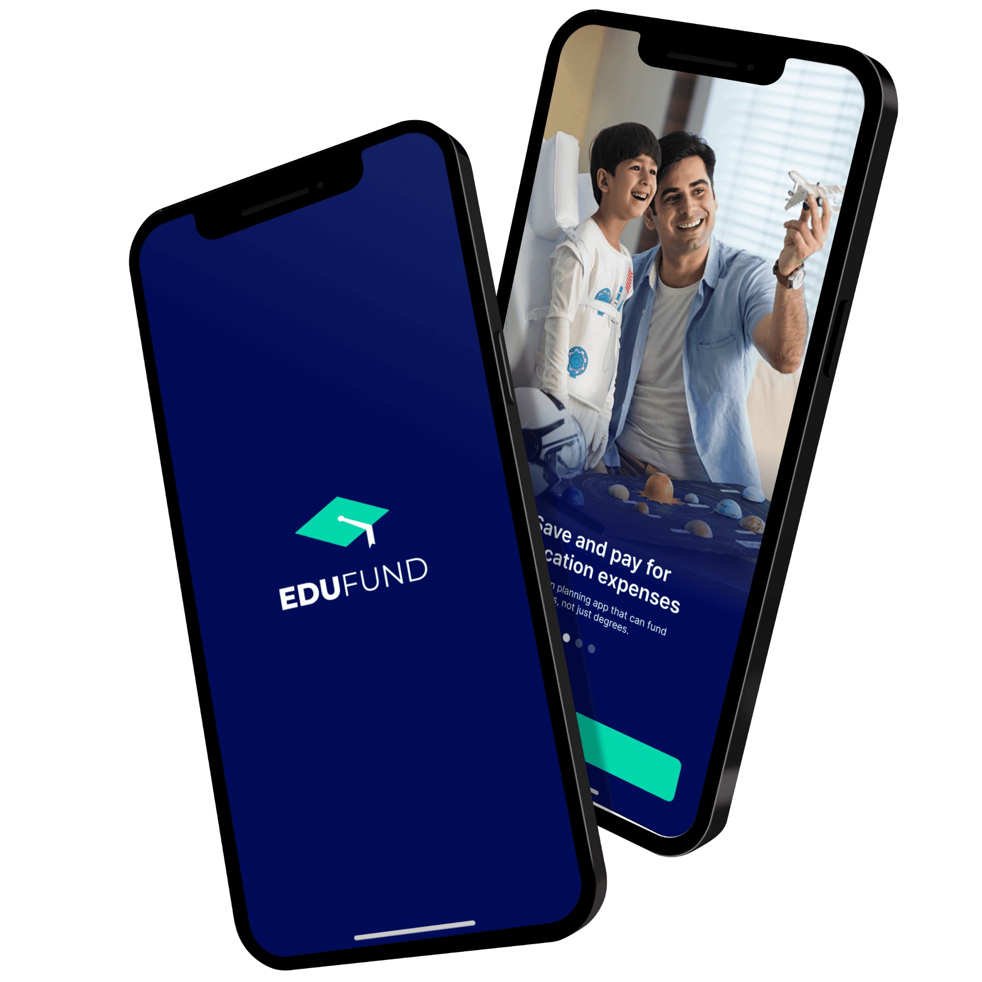
App Onboarding Redesign
Redesigning EduFund mobile app's onboarding journey-from the splash screen to mobile number verification, to enhance user engagement, simplify the process, and ensure a seamless introduction to the platform.
Services
Auditing, User Interface
Duration
2 Days
Industry
Finance
THE BRIEF
Your task is to redesign the onboarding journey of the EduFund mobile app, starting from the splash screen and ending at the point where the user verifies their mobile number.
Your redesign should aim to enhance user engagement, simplify the process, and ensure a seamless introduction to our app.
CURRENT FLOW ISSUES & DETAILED AUDIT
The current splash screen is a combination of the logo (symbol), an animation and the logo (complete with the wordmark) in a dark mode background.
The next frame consists of a vector which is slightly animated, a title with a subtitle, and a CTA which says ‘Get Started’
The Get Started CTA leads you to the phone entry frame, with the heading, sub-heading and a T9 input field for the mobile number.
Upon entering the correct number, the user is directed to the enter otp screen.
Splash Screen 2
Splash Screen 3
Splash Screen 1
Splash Screen 4
Vector and info
Frame 4
The real estate of the screen can be used better on this screen.
The typography could be improved, the verbiage used could be more descriptive and meaningful, and the CTA text could be better highlighted by the use of more legible text size.
The vectors used could be more meaningful, or could be replaced by imagery as it is more impactful. An auto scrolling carousel of
information could also be used.
The typography could be improved on this screen.
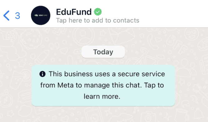
The ? icon at the top right, which denotes a hint, or help, takes the user
to the WhatsApp Chat with the brand itself. This is a great option for instant brand connect & customer service. But, this could be improved for better user clarity by either changing the icon or using better verbiage.
The documentation hyperlinks on the bottom of the screen open links
which direct to the respective pages on the website.

Mobile Number
Frame 5

Logo - Monogram
Frame 1
Animation
Frame 2
Logo - Wordmark
Frame 3


The logo appears twice throughout the splash. This is not required as it is unnecessary repetition. This can be solved by only keeping the whole logo with the monogram and the wordmark.
The animation is too fast to be understood or noticed. This can be replaced by a simpler, more understandable animation, or can be removed.
The typography could be improved on this screen.
Like the timer, the number could also be highlighted to make it distinctive.
A back button appears on this screen at th top left, which is missing in the previous screens.
OTP Verification
Frame 6
CURRENT ONBOARDING FLOW ISSUES - SUMMARISED
The initial splash screen contains too many elements and operates slower than optimal, affecting the user experience negatively.
Improvements are necessary in the app introduction process; the current single screen with brief information could be upgraded to deliver a more engaging and informative user experience.
Throughout the flow, inconsistencies in typography and design detract from the overall user experience.
An icon on one screen performs a different function than expected, leading to user confusion regarding its output and diminishing the user experience.
Documentation links redirecting to the website introduce unnecessary loading time and contain more data than necessary, thereby hindering the user experience.
Inconsistencies arise with the placement of a back button, present on some screens but absent on others, creating a disjointed user experience.
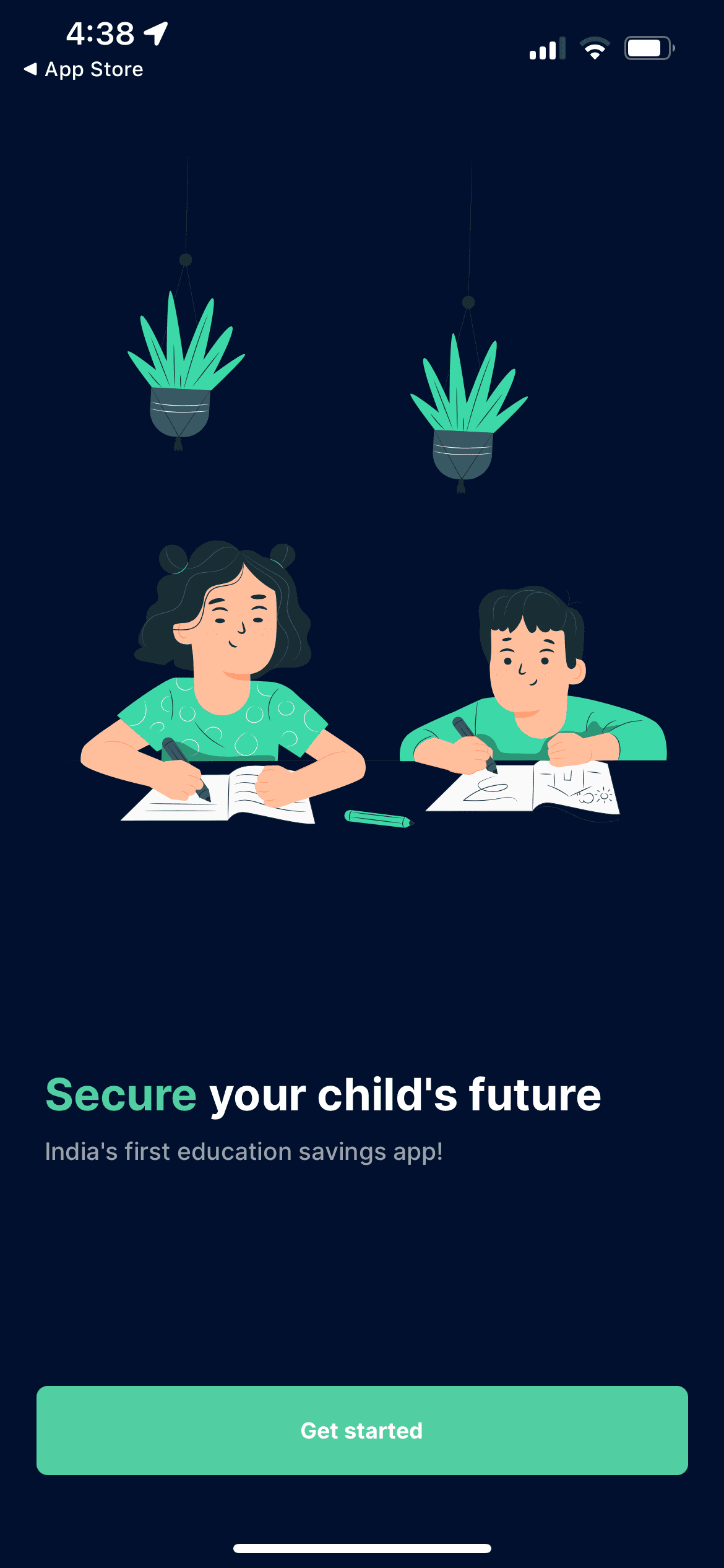
PROPOSED SOLUTION FOR THE FLOW
We will now observe the high fidelity version of the proposed solution for a more immersive and effective onboarding process.
The first frame of the new splash screen has the complete logomark with a background.
The logo itself can be given a simple animation to make the frame more engaging.
Screen 1
Reducing the initial logo splash from 3 screens with abrupt transitions to animation on 1 single screen will reduce the cognitive load to a huge extent, as a smooth and to the point logo would be very simple and clean for the user’s welcome.
The avoidance of the repetition of the logo will make the app look more professional and would increase user trust.
The next frame of the onboarding has a feature carousel of all the important benefits and primary information about the app.
Screen 2
This screen follows a pattern like a walkthrough of a product, but by stating its major features and benefits. It helps the user understand what the app is going to be about and how it will help achieve them meet their financial planning goals for their school/college going children.
The third slide is a testimonial, which provides as a motivation to the user and builds trust on the app even before using it.
The verbiage for the walkthrough is kept short, impactful, and meaningful.
Imagery based approach is follows as it instantly creates user connect, makes the app more aspirational, and the brand appear more mature and responsible.


Login
Save and pay for education expenses
The education planning app that can fund dreams, not just degrees.

India’s first education savings app
Revolutionising how families plan, save and invest for their children's future education.
Login
Expert advice and guidance, personalized financial plans
Secure your child's future with a seamless investing experience.
"School and college expenses are skyrocketing. We wanted to save for our kids' education in advance.
EduFund has made planning for both our children's college expenses a breeze."
Mr. & Mrs. Kulshreshtha,
Parents

Login
Screen 2
The ‘Get Started’ CTA is relabelled as ‘Login’ to make it more relevant.
A skip button is not required on this screen as the user can proceed to the next screen any time using the login CTA.
A phone number log-in is an excellent way to simplify, speed up, reduce friction and increase the security of the overall application. However, alternate log-in options can be proposed as they can increase the probabilities even more.
A light mode can also be explored for the overall UI of the app. It will make the UI cleaner and more legible. A toggle could be added if both the modes are to be provided.
To minimize user effort, consider enabling auto-scroll on the carousel with a delay of 1-2 seconds between slides.

Login
Save and pay for education expenses
The education planning app that can fund dreams, not just degrees.

India’s first education savings app
Revolutionising how families plan, save and invest for their children's future education.
Login
Expert advice and guidance, personalized financial plans
Secure your child's future with a seamless investing experience.
"What we needed is expert advice and guidance. Thankfully, we came across a unique app called EduFund. For my daughter's future, they offered a personalized financial plan. Plus, it's so simple to set up an education fund."
Niraj Chauhan,
Student

Login
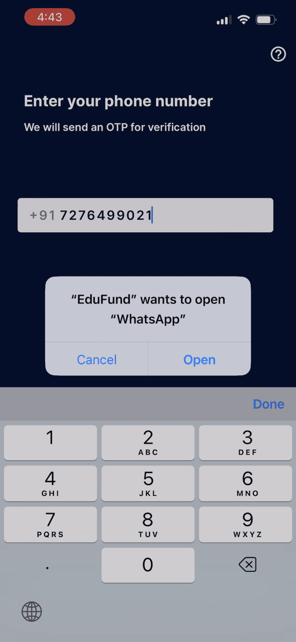
Screen 3
Typography now follows proper hierarchy and spacing in the new UI.
The ? button on the top left is replaced by a text link below the input box.
The text says: ‘Facing issues? Chat with us on WhatsApp to get help.’ which now gives complete clarity of how the user would be assisted in case they get stuck.
Some minor adjustments have been made to the wording to improve clarity and understanding.
The CTA label text colour is changed to black as the previous white text on green background failed various accessibility tests.
The documentations are now natively stored in the app as simple text files an can be loaded faster, without any delay or unnecessary animations, unlike previously.
Enter your phone number
We'll send a verification OTP to you for logging in.
+91 7276 499 021
Send OTP
By proceeding, you agree to EduFund’s Terms & Conditions, Privacy Policy, and Platform Agreement
Facing issues? Chat with us on WhatsApp to get help.
Terms and Conditions
Definitions:
This application ‘EduFund’ (“Platform”) is owned, operated, and managed by Helena Edtech Private Limited (“Company”), a company established under the Companies Act, of 2013. These terms and conditions of use (“T&C”) mandate the terms on which the users (“User”) will visit, access, and register on the Platform.
The access to or use of the services offered through the Platform by the Company (“Services”) are conditioned upon the User’s agreement to these T&Cs detailed below. Please read the T&C along with the (“Privacy Policy”) (“Refund Policy”)carefully before registering on the Platform or accessing any data, material, or information available on the Platform. By visiting, accessing, and registering on the Platform, you agree to these T&Cs and to the Company’s Privacy Policy.
The Company hereby gives the User a limited, non-exclusive, non-transferable right to access the Services on the Platform.
Further, by submitting our form you agree to receive promotional calls on the number shared, and such calls and SMS would be coming from a third-party platform.
User Restrictions:
User acknowledges the following:
User agrees that it shall not copy, reproduce, sell, publish, enter into a database, display, modify, alter, transmit, license, transfer or in any way exploit any part of any information, content, materials, services available from or through the Platform, except for its personal and non-commercial use.
User agrees that it will not use the Platform for any purpose that is unlawful or prohibited by these T&C or under applicable laws. User also agrees that it will not use the Platform in any manner that could damage, disable or impair the Platform, or interfere with any other party’s use, or enjoyment of the Platform.
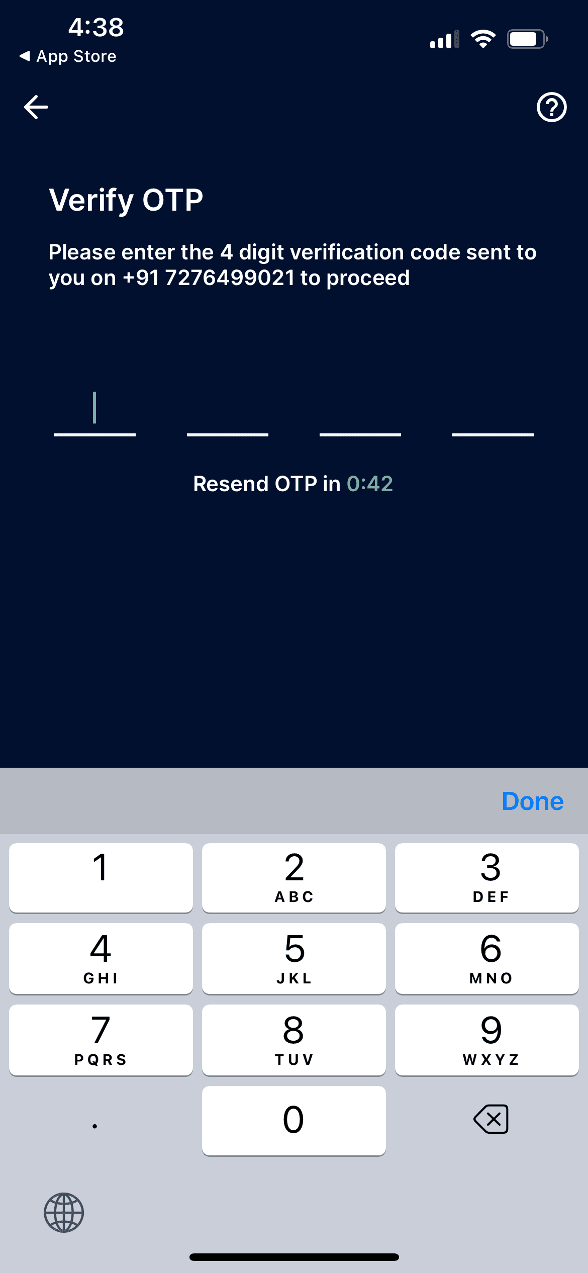
Enter the OTP
Please enter the 4-digit code we just sent to +91 7276 499 021.
Resend ОТР in 0:42
8
5
2
1
Logging In
Facing issues? Chat with us on WhatsApp to get help.
The next frame of the onboarding has the login using phone number & OTP functionality.